Designed an emergency alert system using Claude Design

CONTEXT

1. ISN's customers are large industrial sites — oil & gas, and manufacturing companies. Hundreds of contractors move through these sites everyday.

2. ISN's Visitor Management System (VMS) logs every visitor check-in and check-out, tracking who's on site.

3. But when an emergency hits — fire, gas leak, or severe weather, that log is just a list. There's no way to push a warning or know who’s safe or unsafe.
PROBLEM
How might we help a site host warn the contractors when an emergency strikes, and account for their safety?
FINAL SOLUTION
We shipped 'Emergency Notifications'
The solution, ‘Emergency Notifications’ within the Visitor Management System web app, enables the site host to:
PROCESS
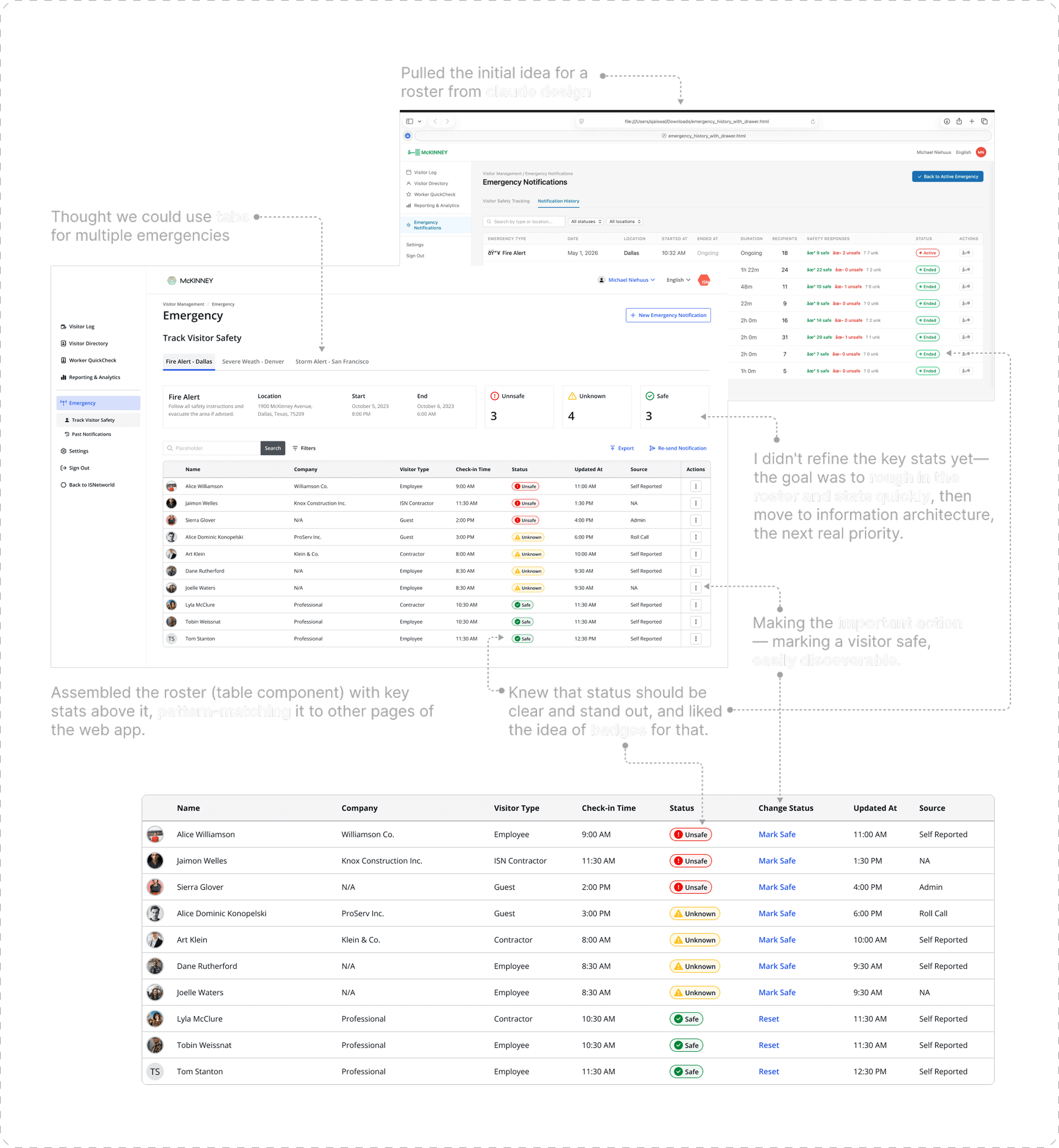
To begin with, I first designed the meaty part of the feature — 'the roster' that the PM strongly focused on.
The roster is the list of contractors to whom the emergency notification has been sent by the site host, and allows for real-time safety status monitoring of the contractors.
As the PM highly focused on the roster, I designed that first, and then moved to figuring the information architecture of different sub-features.
Next, I resolved the bigger question: information architecture
With the roster in place, I turned to the bigger question: where the different parts of the feature would live and how they'd be connected to each other — the information architecture.
The different parts included:
Live Emergency (we earlier called it ‘track visitor safety’), Past Emergency (earlier called ‘past notifications’) and Send Notification (earlier called ‘create notification’) – each lives as a separate sub page on the left nav bar.
I retained the old design for 'create new notification', for this option.
'Sending a new emergency' function accessed through button at the top right.
Separate sub pages for 'Track Visitor Safety' and 'Past Notifications'.
The PM liked the idea of creating new notification through a modal as it aligned with other pages of the VMS app.
As most days there won't be an emergency, we could keep 'send notification' section at the top. But as an emergency happens, the 'send notification' section gets pushed below.
Button at the top right for Past Notifications.
I didn’t like this option as switching tabs usually controls the entire space underneath. The page would have become really long as well.
Suggested the following to the PM
As I discussed the above options with the PM, I learned that on any given day there would not be more than 2-3 emergencies. Our discussion led me to suggest the following to him. And we were aligned.
Shared a mock containing the above suggestions with the PM.

Next, I refined the visual design of the emergency cards
After trying a bunch of options, I decided to group the information in 3 buckets, each having it’s zone.

For manage template function, I introduced a two-panel modal to reduce the number of screens
For the 'Manage Emergency Templates' modal, I needed the user to be able to do the following:
I wanted the user to be able to accomplish this within a single modal. From my initial sketches, I felt we could use one panel for selection, and other one for editing. So I prompted claude design accordingly, and got the design below.
Since such a modal wasn't used elsewhere, I checked with the developers whether it'd be easy to build. They said it would, so we went ahead and added it to our design system.
Next, I adapted the design from Claude Design into our design system, refined it visually, removed unnecessary information, and added what the user would need. Below is the final modal design we shipped.
IMPROVING AI WORKFLOW
But why did the design system used by Claude Design looked so different from ours?
Primarily because this project lives within the Visitor Management System (think child)—a web portal that opens from ISNetworld (think parent). VMS uses a slightly different, leaner color palette than ISNetworld. And since VMS is fairly new, it didn't have a documented, dedicated design system—we mostly used ISNetworld's design system components, which we'd uploaded to Claude Design. That's why the Claude Design mocks looked different from the final VMS screens.
For future projects, we've uploaded certain VMS screens as 'templates' in Claude Design, so the mocks come out closer to VMS.
REFLECTIONS
Rough in the big rocks first
When designing a big, complex feature like this one from 0 to 1, I first identified the big problems to solve: what does the roster look like, and how would the different sub-features connect to each other (information architecture)?
I first resolved the bigger of the two problems, the roster, to nearly 75%, then quickly moved to the next important one, the information architecture. Once the latter was mostly set, refining the roster and the other functions felt easy.
Introducing new components to resolve complexity for the user
This project had many such instances. For example, I introduced an accordion with a roster inside it, and a two-panel modal to reduce the number of screens. The underlying idea was always the same: how do we surface complex information in a way the user finds easy to interact with. Sometimes through progressive disclosure (the accordion), other times by optimizing layout to cut extra screens (the modal). These new components became valuable additions to our design system.