In-line explainer modules
Designing for Trust at the New York Times

BACKGROUND
The What, Why and How
Before we begin, I’d like to share some information about the Trust team that’s important for this project.

PROBLEM
How might we bring transparency and context to NYT articles in order to reinforce readers’ trust?
FINAL SOLUTION
In-line explainer modules
Inline-explainers are bite-sized modules placed contextually within NYT articles revealing the processes and policies that back NYT’s journalism. For instance, if an article contains any form of vulgarity, then sharing with the readers why we published it, brings transparency to the journalism and thereby reinforces trust.

PROCESS
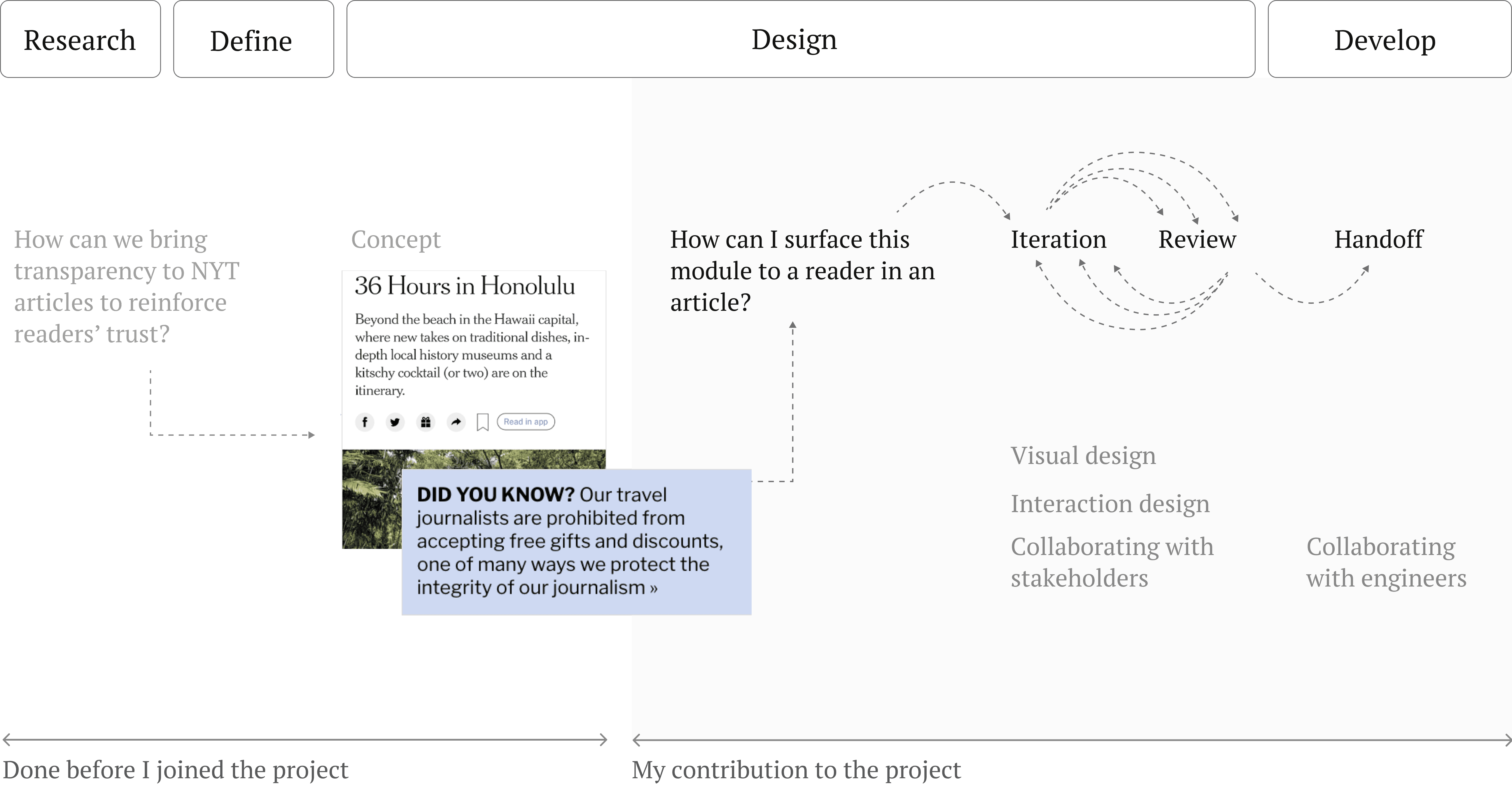
But, how did we arrive at the solution?
The following diagram encapsulates the answer wherein I’ve marked my contribution to the project.
CONCEPT AND USER FEEDBACK
Understanding previous stages
As I had joined the project mid-way, I asked my manager about what all had already been done and I learnt that the team had covered the primary concept and had conducted a user feedback session on the preliminary prototype. In the diagrams below, I’ve summarized the two.


DESIGN ITERATION PHASE 1
After having learnt about the concept and user feedback, my manager asked me to explore the prototypes for the module. So, next I focussed on:
How might I surface the module to a reader in an article?
To begin with, I started thinking about the problem through the lens of visual design.

I also started to think about how would a reader be interacting with this module in an article.
DESIGN REVIEW PHASE -1
“Align the designs with the design patterns used in NYT articles.”
I presented my design ideas to my manager and realized that while the icon and heading were great to add to the module, my designs were a bit foreign to be introduced and needed more alignment with the design patterns used at NYT.
So I did a Pattern Audit to study how ancillary information is surfaced within NYT articles.

DESIGN ITERATION - PHASE 2
Adhering to NYT’s design patterns
In the following iterations, I tried to bring my designs close to NYT’s design patterns.

While the above iterations were static, I also explored two other design patterns — carousel and accordions.
Carousel
DESIGN REVIEW PHASE 2
Stakeholder Feedback
On presenting the above iterations to the stakeholders, I received the following feedback:

DESIGN ITERATION PHASE 3
Incorporating Feedback

LAUNCHED DESIGN
Final Design
POST LAUNCH DESIGN ADDITION
Feedback Mechanism
After the launch, a feedback mechanism was to be added. I explored two possibilities with variations in color and size:
Thumbs up/down icons
Yes/No button

After many discussions with designers from the design system team, this is the one that got approved. We chose the Yes/No buttons over thumb up/down arrow for two reasons:
Thumbs up/down have a like/dislike connotation which is not what we intend to ask
Reading and clicking on Yes/No button is more intentional.
As per WCAG guideline 1.4.1 on ‘Use of color’, color should not be the only medium for indicating an action. Hence, we considered the following possibilities:

LEARNINGS FROM DESIGN HANDOFF
Collaborating with engineers
I created detailed handoffs on Figma for both inline modules and the repository. I had the following learnings:
It’s always safe to over-communicate than under-communicate in design handoffs.
It’s required to communicate in the engineers’ language during VQA’s.

If I were to run user-testing...
I didn’t get to do user-testing for the finalized prototype for the launch, but if I were to, I would ask the following questions:
